The first example is the Slovensky rozhlas, the Slovak radio and communications building.
I haven't had a chance to go inside, but the interior houses a beautifully designed music theater, that I would love to see in person someday. The office spaces and lobby look cool, too.
Next up is the Hotel Kyjev and My Bratislava shopping complex on Kamenne Square, which is right next door to our apartment. Now, clearly a lot of buildings were demolished to make room for this complex, and I kind of don't want to know what they were. All I've seen of it is this photo:
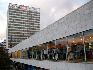
Hotel Kyjev is looking a bit dumpy these days (and it's currently closed for a complete interior overhaul), but it's not your typical grey panelak. The lines, the suspended box form, and the nice marble along the sides sets it apart from the usual drab Communist concrete monstrosities. It sits (almost hovers) dramatically on the eastern end of a long, white marble-clad rectangular strip, which houses several businesses including a large Tesco. Adjacent to this at its western end is a tall, triangular building with matching white marble, containing more department stores and a cafe. The appeal is definitely subtle, but when you step back and take it all in, follow the lines, the design is pleasantly modern and pretty well thought out.
Hotel Kyjev has an ornately futuristic lobby and adjacent bar. Both are said to be prime examples of adventurous 1960s Communist architecture and design. I really wish I could have seen these rooms before the hotel's closure.
Tacky contemporary signage and a junky jumble of colors and goods seen through the shop windows all detract from the overall effect, but it's still more stimulating than your average shopping complex. If I saw what was razed to make room for this thing, I'd probably cry. On the other hand, at least this does not scar the historical center the way that the UFO bridge does, and its construction did not decimate the history of the city's Jewish population. I can't say I love this complex, but there are things about it I like, and I can see where they were coming from with the overall design. (Strangely enough - a developer who recently bought the complex initially wanted to demolish the whole thing! History repeats. But a huge outcry from both the public and architectural community saved it, so the Kyjev will live on for now).
In my last post I had some pretty harsh words for the hideous appendage to the front of Water Barracks wing of the Slovak National Gallery. Nothing will change my opinion of that heaping turd. However, at the rear of the Water Barracks, is an add-on that looks like this:
This is modernism that works. It's playful and eye-catching, if a wee bit clunky. Yet strangely, it can only be seen from a narrow side street. Now, had they worked something like this into the front of the Water Barracks, I could forgive that it wouldn't integrate well with its more neoclassical styled neighbors. But at least it would be pleasing to look at! But no, this was added to the rear of the building, in a back alley where few people ever lay eyes on it. Go figure.
My last example is actually in the town of Banska Bystrica, the capital of one of Slovakia's central regions.
This is the museum of the Slovak National Uprising, which details the epic and bloody struggle during WWII between the Nazis and the Soviets, as well as the partisans who rose up against Nazi control of Slovakia, and who were eventually aided by the Soviets. The structure is truly stunning, and has to be one of the coolest Communist-era exteriors I've seen. Yeah, it's a little strange that there are no windows on the outer sides (I think you could've made it work without comprising the design), but it's still a striking and tasteful example of modern architecture. The curvy, oblong shapes are playful yet dramatic. The building is wisely set apart from the historical center, inhabiting its own space. I like it. I haven't gone inside, but I hope to on our next visit to Banksa Bystrica. See more (and better) photos here and here.
Also very much worth noting are a couple of extremely groovy interiors. First is the lobby of the Trade Union House, which is quite a striking contrast from the building's hideous, grey, blah exterior. Second is the stunning reception lounge for guests of state at the Bratislava airport (which, sadly, I'll never get to visit unless I win a political office), which looks totally Star Wars.
The moral of the story - for a little while, architects in Soviet-dominated Czechoslovakia were allowed to let their imaginations run wild, and as long as they weren't butchering vast areas of historical centers to make silly looking bridges, they came up with some genuinely exciting and innovative stuff. (There is an interesting looking book on this very subject). Sadly, this period came to an end in the 70s during a phase called "normalization," when Petrzalka was built and drab panelaks spread like wildfire across the country. Many of these visionary architects were involved with or sympathetic to the Prague Spring uprisings in '68, and were punished for it by being forced out of their jobs/careers, bringing this chapter in Slovakia's architectural history to an abrupt halt.
(Click to see photos taken this month of Bratislava and recent day trips to Vienna).


awesome pics and thorough explanation of slovakian architecture.
ReplyDeletei attended your dads Bible study today and he introduced me to your blog. my wife is from presov and we live in lake wildwood. ..perfect example of a small world !
Thanks! A small world indeed. And it gets smaller: my brother-in-law is currently dating a woman from Presov. Čau!
Delete